


Collete's Childrens Home
Helping women and children find safety, starting with the tools behind the scenes.
Role
UX/ UI Designer
Team
9 Developers, 4 Designers
Timeline
Sep 2024 - Nov 2024
Status
Live, June 2024
The Challenge
Every client intake was filled out on paper and every grant report was assembled by hand in Excel. The staff doing this work cared deeply, but they needed better and more efficient tools as their organization and clientele grew in size.
Research
Starting with conversations
I began with interviews and direct observation with CCH staff, ranging from confident tech users to first-time tech users. The pattern was clear amongst all of my interviews: capable people but inadequate tools to help them with their specific needs.
Fragmented Workflow
Information Overload
Lack of Clarity
Overall
They needed a tool that works with them, not against them.
Design Process
Iteration is key.
My team and I started in FigJam , mapping user flows, defining permissions, and thinking through how all three user types would move through the product. Once the structure felt solid, we moved into Figma and began iterating.
The Login
We had multiple different users, but they all have different platform needs.
The first version opened with a "Who's logging in?" screen and three avatar CTAs for Admin, Case Manager, and Client, and each role branched into its own separate login and account-creation flow. It felt intuitive at first glance, but maintaining three parallel flows was expensive, and putting the full role structure and a create-account path on the very first screen raised a security question we hadn't fully thought through.


We consolidated the login page into a single credential flow. The role selector stays up front because it's a clear, human way to open, but every role now runs the same path underneath: pick your role, sign in with your username and password, then confirm with a PIN. One flow to build and maintain instead of three, and the PIN acts as a genuine second factor, which felt right for a platform handling sensitive case data.
Admin Dashboard
Adding too many features can be overbearing.
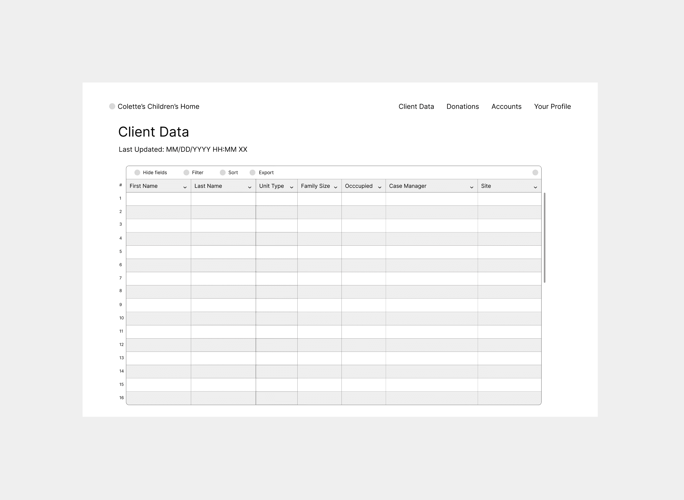
My early client-data dashboards showed everything at once : client records, donations, stats, account settings in one flat table. The tools were all there; the toolbar already had filter, sort, and export. But nothing was prioritized, so an admin landed on a wall of undifferentiated rows and had to hunt for whatever they came to do. It felt like opening a spreadsheet with no column headers.

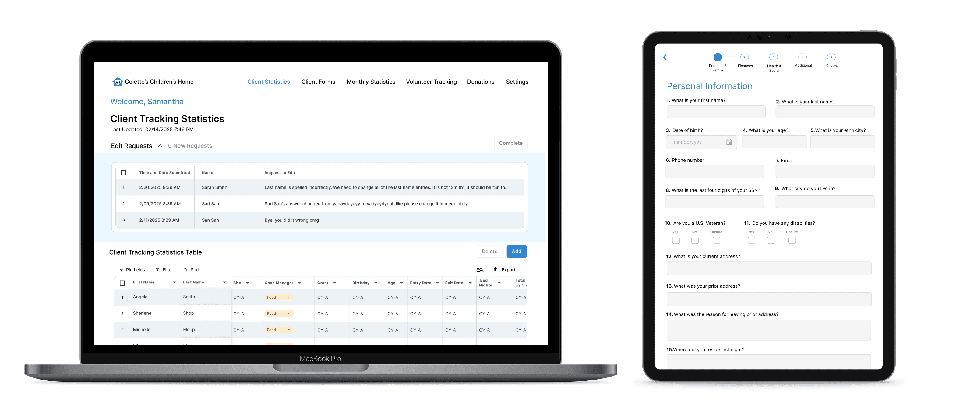
The final dashboard is structured around what admins actually do: check client stats, review edit requests, manage donations, and run grant reports. The biggest shift isn't a new feature but governance. Corrections to client records now flow through an edit-request queue that admins review and approve, so the master record stays a single, auditable source of truth rather than something anyone can overwrite.
Case Manager Portal
Too much access, not enough clarity.
The first pass gave case managers a view that looked almost identical to the admin dashboard : same tables, same navigation bar, just with some buttons greyed out. It was confusing and left users having to learn the system rather than intuitively solving their problems.


We redesigned the portal around what case managers actually need: monthly stats, client comment logs, and a donation tracker. The navigation reflects their role. Our main goal for our final iteration was to have less cognitive load, which gave Case Managers more confidence to do their work.
Client Facing Forms
A form that felt like a form.
The first version stacked all questions on a single long scroll, and while it was fast to build, it was hard to parse. For someone filling this out in a shelter, potentially on a tough day, it was overwhelming before they even started. We had all the right question but the way it was visually displayed needed to be tweaked.
First Iteration


We broke every form into single-question flows with a progress bar at the top. Large touch targets for iPad. Back/forward navigation so nothing felt final until the user is ready to move on and the most important granular detail was the language. The tone shifted from "fill this out" to "we're just going to ask you a few things." We wanted the form to feel warm and friendly and this final iteration took this into account.
What I Learned
This was my first time building a product from nothing. No existing design system to reference, no legacy flows to follow. That turned out to be one of the most valuable constraints I've ever worked within.
When someone is tired or overwhelmed, a confusing button isn't just friction, it's a barrier. We cut three features we thought were clever and made the ones that stayed genuinely obvious.
We mapped out the three-role structure in FigJam before touching Figma, and it saved us from so many painful edge cases down the line.
Things we assumed were obvious such as form titles, search hierarchy but it turned out to be the exact places people got stuck. Two rounds of testing meant we shipped things that actually worked.
What started as a paper form problem became something that gives CCH reliable, exportable data for the first time. That data helps them tell their story to funders and keep their doors open.
Glad our paths crossed. Let's keep in touch!


